Join us for the kick of our Spring 2019 Transparency Series sessions at Columbia Journalism School. For our first installment, we will be looking at Data Visualization. On Friday, February 15, we are joined by Jeremy White, New York Times, to hear about his work and their process for finding and telling stories through data. On Saturday, we’re joined by Agnes Chang, ProPublica, who will walk students through a day crash course on how to produce data visualizations.
Descriptions below and full details/registration at transparency.brown.columbia.edu.
Feb 15, 2019 at 5pm
Maps, charts, and graphs have become an almost essential part of the journalistic practice, as well as the centerpiece of many published pieces. But how can we best incorporate these tools into our investigative process, and how do we design them to be as engaging and insightful as possible? Join us for a conversation with Jeremy White, graphics editor at The New York Times, who will share with us some of the lessons learned and the details behind the crafting of pieces such as the now famous Snow Fall: The Avalanche at Tunnel Creek, and Reshaping New York, and the more contemporary Antarctic Dispatches, See Inside Typhoon Mangkhut and the Times Olympics coverage.
Jeremy White is a graphics editor for The New York Times and an adjunct professor at Columbia University. He has contributed to a variety of visual projects that have earned several Emmy nominations, a Peabody award, and top honors from the Society of News Design, World Press Photo and Pictures of the Year International. Prior to joining the Times, he created motion, interactive and print graphics for the company he founded in 1998, blueshirt, serving clients such as Toyota, Fiat, Sony, and Microsoft.
Feb 16 2019 from 10am to 5pm
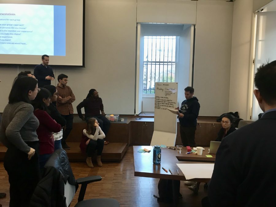
Data visualization has become a multipurpose tool in journalistic practice. It allows us to see patterns in data and to discover new stories, as well as to insightfully communicate our findings. In this day-long workshop, Agnes Chang from ProPublica will guide us through basic data visualization tools and skills, delving into the design process and some of the graphic strategies that make the best data visualization pieces so successful. During the day we will touch upon the multiple aspects of data visualization: from exploring and cleaning up a dataset, to crafting the narrative of the piece, to designing its graphic aspects, to coding its interactive elements.
Agnes Chang is an editorial experience designer at ProPublica. Previously, she spent six years at the New York Times where she launched the company’s proprietary 360 video player and also led user strategy and daily operations for NYT Cooking, one of the Times’ most popular products. More recently, Agnes has served as an adjunct professor at Parsons School of Design and Columbia University. She is a graduate of Wellesley College and has an M.S. in Media Arts & Science from the MIT Media Lab.

