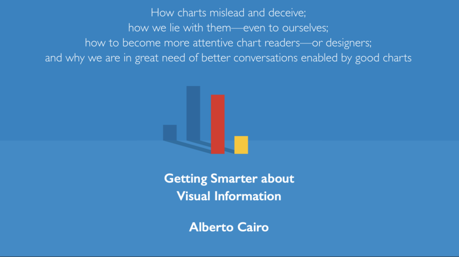
Alberto Cairo is an associate professor and Knight Chair of Visual Journalism at the University of Miami. He recorded this interview with Alex Calderwood before delivering a lecture about his recently released book How Charts Lie: Getting Smarter about Visual Information.
What spurred you to write this book? Have you been thinking about it for a while?
So, I’m a journalist and I’m a designer. I have been working on designing information graphics since 1997, or something like that. I worked in the news industry in Spain and in Brazil, and I’ve been teaching this craft for many years at the University of North Carolina, Chapel Hill, and now in Miami.
When I was working in newsrooms, I sort of absorbed the culture of information graphics: certain mantras that I will describe today, myths such as “a picture’s worth a thousand words,” or “show don’t tell.” I absorbed that knowledge and I adopted those mantras. But when I became a professor, I started actually observing how people—normal people—read charts. I discovered that many of the assumptions that I had to make myself were completely wrong.
A graphic, for example, that I thought was very clear, ended up not being clear for people. And I discovered that the problem is in part that we tend to approach graphs and maps and charts—data visualizations in general—as if they were illustrations that can be understood intuitively. And what we need to internalize is that data visualizations are not images per se. They are arguments, which is the point that I make in the book. [A data visualization], it’s an argument. It has a symbolic system, it has a grammar, and it has a semantics level. So, it’s like a text.
There’s a rhetoric to it.
Absolutely. And therefore, in order to be understood, charts need to be read, they cannot just be seen, which is a theme that I have talked about in previous books, but I wanted to translate that to more of a general audience in this latest book, which is basically a manual of how to read charts.
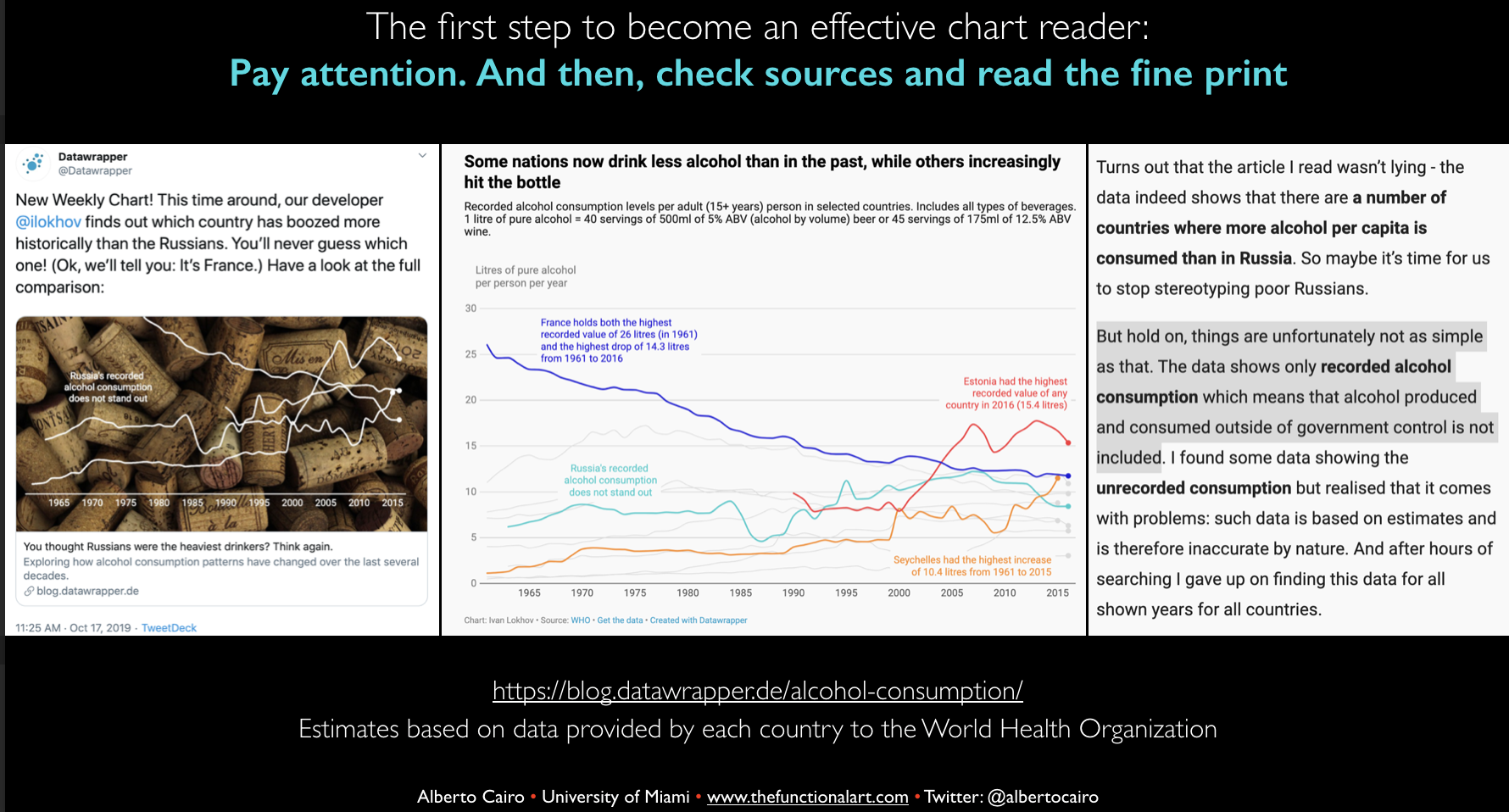
So, I started observing, for example, how ambiguous those charts can be, I started seeing how people—and that includes everyone—how we project our own beliefs onto charts to confirm what we want to believe. The book is not so much about how people lie with charts, it’s about how we lie to ourselves. One of the main points of the book is that even the best-designed chart can be misinterpreted if it’s not read carefully. It’s a book that talks about paying attention if you want to decode a chart properly.
So that’s what prompted me to write it. I thought that there was a need to reinforce these ideas. That sounds so obvious when you verbalize it, but it’s not obvious at all. People misinterpret charts all the time, because, again, we assume that glancing at it and moving away, we will understand it. And that’s not true. That’s what I want to advocate for, that culture of attention whenever we see a chart. And the 2016 election, obviously, the deluge of misleading charts and maps that I believe are going to get worse in the current campaign, leading up to 2020. People on both sides of the political spectrum are throwing charts and maps at each other to prove the other side is wrong, sometimes misinterpreting the data, cherry-picking the data, or distorting the data. I wanted to write the book as a weapon case, as a protective shield.
And, it’s a book not about charts in the abstract, you approach climate data—
Yeah, because the chart doesn’t matter on its own! What matters is the content of the message it conveys. Charts can be very powerful; they can be very persuasive.
In the book, I also describe how excited I am about charts. Obviously I believe in the power of charts, right? But with great power comes great responsibility. We need to be responsible users of charts, but we need to be responsible readers of charts as well.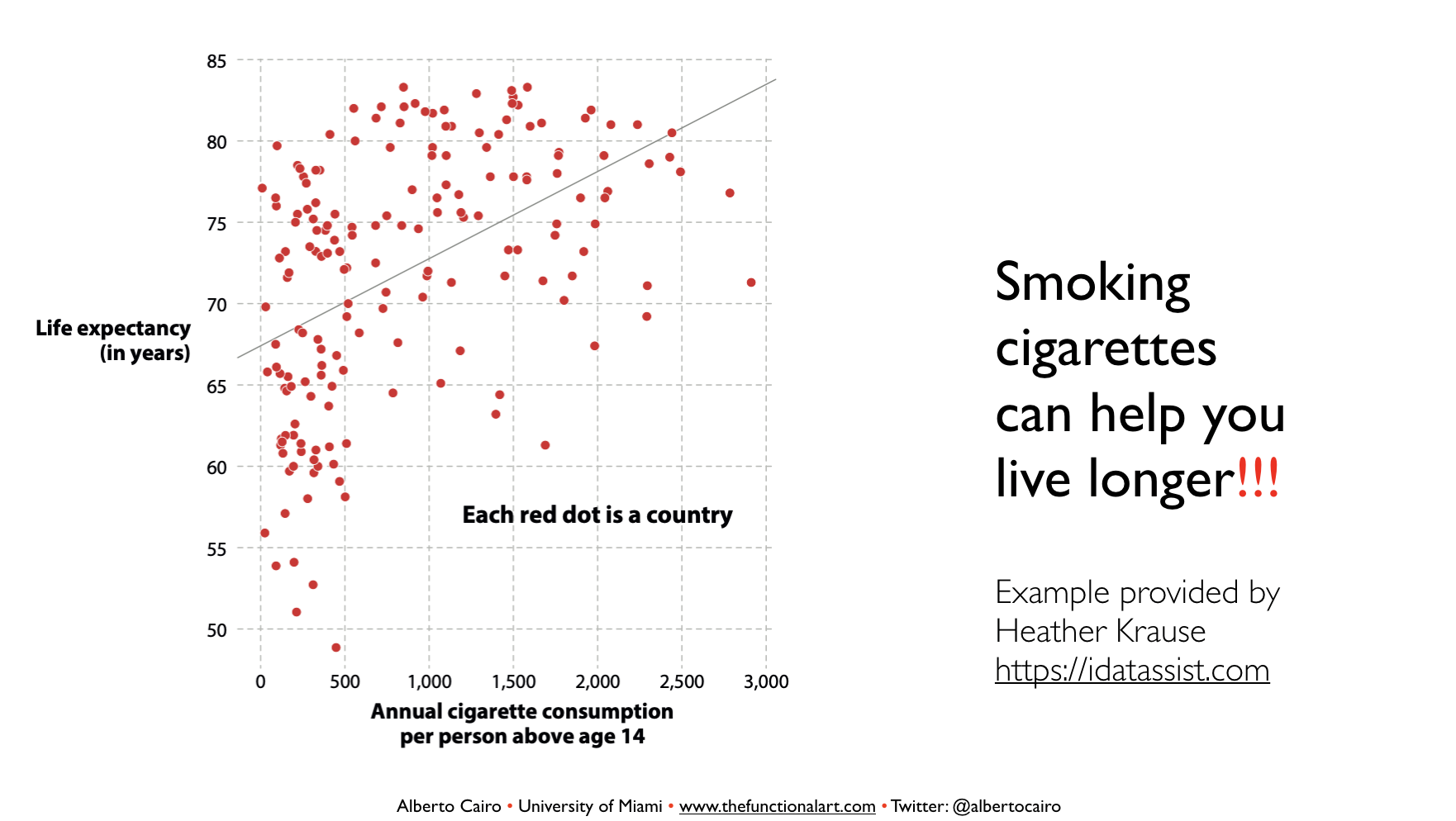
How did you choose which charts would make it into the book? Because it was fun reading it, every page has something new, many graphics that I’d never seen before. And they’re often very complicated—you didn’t just pick out the easiest ones—you had some interesting time series plots, etc.
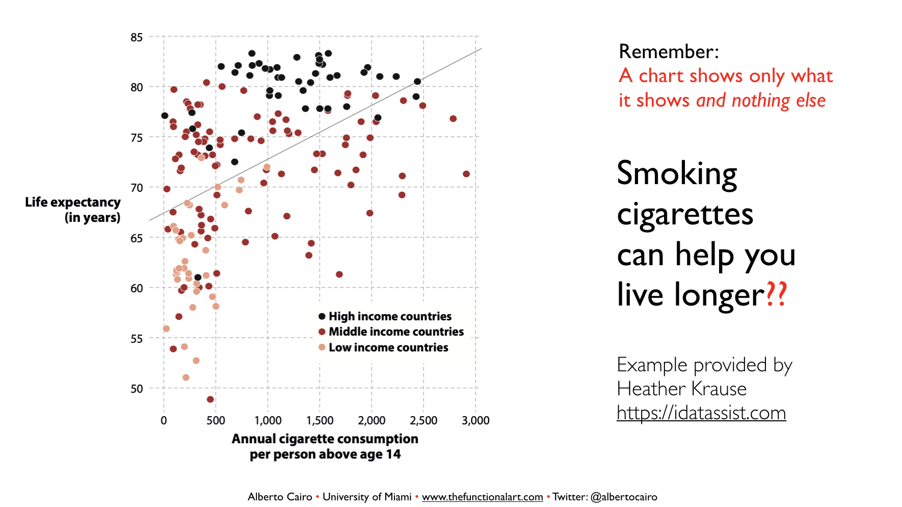
I actually want to make a point about that. This is one of the intentions of the book. There are many articles online about how charts mislead readers, but they tend to focus on the most obvious examples—truncating the Y-axis on a bar graph—and we need to keep talking about those examples. But I wanted to go way beyond that. For example Simpson’s Paradox, or the ecological fallacy, which are things that are not described in statistics books, but not in popular science.
So as for how I chose the examples, I have a personal collection of charts. Whatever I see I screenshot or save. So, I have this huge collection. I thought about it this way: What are the main themes I want to cover, the main messages I want to come back to? “Pay attention to the source”, “Pay attention to how the data is represented”, “Pay attention to whether you’re projecting into the chart”, “Pay attention to whether you’re taking uncertainty into account.” I drew the examples that benefited each one of these sections. There’s quite a lot of overlap. I tried to group them.
Successfully too! It did feel like each chart built on the fallacies or mistakes you’ve already touched on. And I don’t remember reading anything that directed your attention to the charts so much. It really felt that there was this engagement the reader had to take part in.
And that’s intentional, because that’s the main theme of the book. Right? Like. You need to pay attention! One of the jokes I make in the book, and it’s actually no joke, is that all of the mistakes that I point out in the book are mistakes that I have made myself. So, I wanted to write the book as if I were talking to myself, years ago. That’s the way that I write all my books.
What did you learn through writing the book? And what tips would you give yourself before you started writing it?
Well, wow, yeah, alright, so pay more attention to the printing process. Now that I’ve seen the book, I detected a couple of printing errors. They happened between the galleys and the actual printing. So be more on top of the production of the actual book itself.
Perhaps give myself a little bit more time in developing the examples a little bit more carefully. Although I’m pretty happy with the outcome of the book, there are certain examples that I feel that I could have explained a little bit further, a little bit more. The election maps for example, the ones that I open up with. I think that’s a fine section, but I would have liked to perhaps show more, go a bit deeper into that. But, you know, once you finish writing a book you need to move on.
A book is like an online story. You publish it and if you read it, you’re going to detect your own mistakes. It’s very easy to fall into the trap of improving and improving endlessly. I know writers who like to go back to their books and publish like 10 or 12 editions of their own books, but I feel that once I have said something, I need to move on and say something else, or study something else, or discover something else, because books are also processes of discovery. They are processes of learning.
One good example is the section—going back to the theme of the ecological fallacy and Simpson—I learned them better myself, right? I grounded my own knowledge of all that, by explaining them. People say that the best way to learn something is to try and teach it because that’s when you discover gaps in your knowledge, right? Or the assumptions you unconsciously make about the way you’ve designed things.
There were a lot of great ‘one-liners’ that you come back to in the book. Like, what was it: “The chart only shows what the chart shows?”
Yes, which is a very important concept related to this idea of “Don’t read more than you should into anything.” Don’t assign intentionality.
The understanding of a chart doesn’t happen because of the chart itself. It happens because of the interaction between an active brain and the chart, right? The active brain comes to the chart with certain assumptions, certain desires, certain judgments. And it’s very easy to project those into the chart, and actually envision those things into the chart, when they are not really there. And that’s why it’s so important to keep that mantra. And it is sort of a mindful mantra, the chart shows only what it shows and nothing else. You do need to become mindful of that because it happens to all of us.
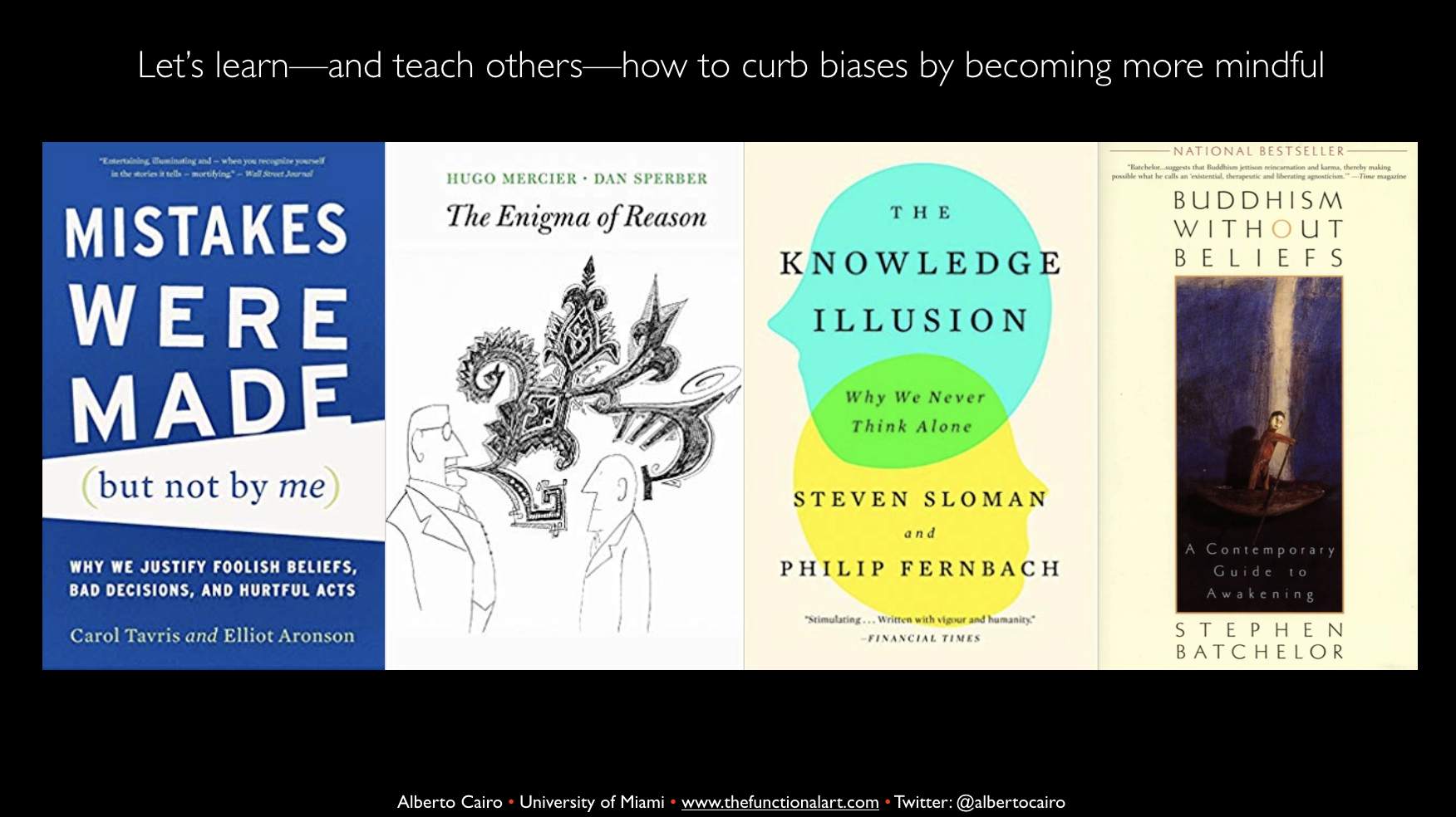
One interesting thing about your prior question, what did you learn—I have always been very interested in the literature about cognitive biases, attention, mindfulness, Buddhism also. It’s all interrelated, right? And how agnostic and secular Buddhism sort of helps you develop a more attentive stance towards what you see. I learned more about that through the book, because that’s the underlying theme of the book.
The book is not really a book about charts per se. It’s a book about cultivating a culture of attention to things that sometimes we don’t cast enough attention upon, that we take for granted because they look so intuitive and easy to read. So, it is a warning. You unconsciously assume that this is very easy to read. Abandon that assumption, it is not true.
So how does someone take what they’ve read in this book—the mindfulness elements—and continually apply them?
One of the things I am going to talk about [in today’s talk] is educating children in attention. Teaching them how opinions bubble up inside your own brain, how emotions bubble up inside your brain, learning to observe your own inner workings from the outside, which is what mindfulness is. That can be taught, and it can be learned, through practice. That needs to be learned at the individual level. And by learning it at the individual level, it can be spread out.
I think one of the main problems that we are facing, particularly Western societies that are dealing with increasing divisions, psychological divisions, etc. is that we don’t pay attention. The lack of attention that we pay to each other, or the lack of attention to what we see, and the fact that we project what we want to see, that’s part of the problem as well. If we could cultivate a culture of attention, we will be kinder to each other, more understanding too…
Most people don’t like to lie to us. One of the things in the book is about ethical standards, right? The book that I’m writing now actually expands on this ethical stance. The next book is mostly for designers, journalists, etc. It says you need to basically approach [designing a visualization] as saying “the message I’m going to put in here is going to be consumed by someone else”. Therefore, the assumptions that I make, the way I tell the story, it needs to be seen by myself, but also, I need to see it from the outside. Whatever I am doing in designing this graphic should have the potential to become a universal rule. “Whatever you don’t like to be done to you, you should not do unto others,” right? That’s the golden rule in ethical thinking, that’s also hinted in How Charts Lie in the very last section.
It drives me crazy in the past few years, how much blame we put onto the technology companies that provide or carry information. Twitter, Facebook, you know, enforce certain divisions, etc. It is true that those platforms have a responsibility; they have screwed up and they need to change their policies and they need to be more attentive. And they need to assume they are media companies, not just platforms. However, in the discussions that I have seen these days, I’m always missing the role of the person who consumes the information. It’s like readers are like children, that they are given information and they don’t have a personal responsibility to deal with that information. That’s wrong. I’m a great believer in personal responsibility.
“I have not read the story carefully, or I retweeted this graphic mindlessly, without thinking about it.” That’s ethically wrong. It’s bad practice… Jonathan Haidt has this book, The Righteous Mind, which I mention in How Charts Lie. He doesn’t think that we can overcome, you know, these impulses, biases, etc. I don’t think we can overcome them completely, we’re human beings, right? But we can correct them, we can become more aware, we can become more deliberate. That’s the key thing: we need to become more deliberate.